07
07
07
Spotify Inspo
Spotify Inspo
Spotify Inspo
Client
Client
Spotify
Spotify
tagline
tagline
Inspiring London's Commuters
Inspiring London's Commuters
Year
Year
2025
2025
About
About
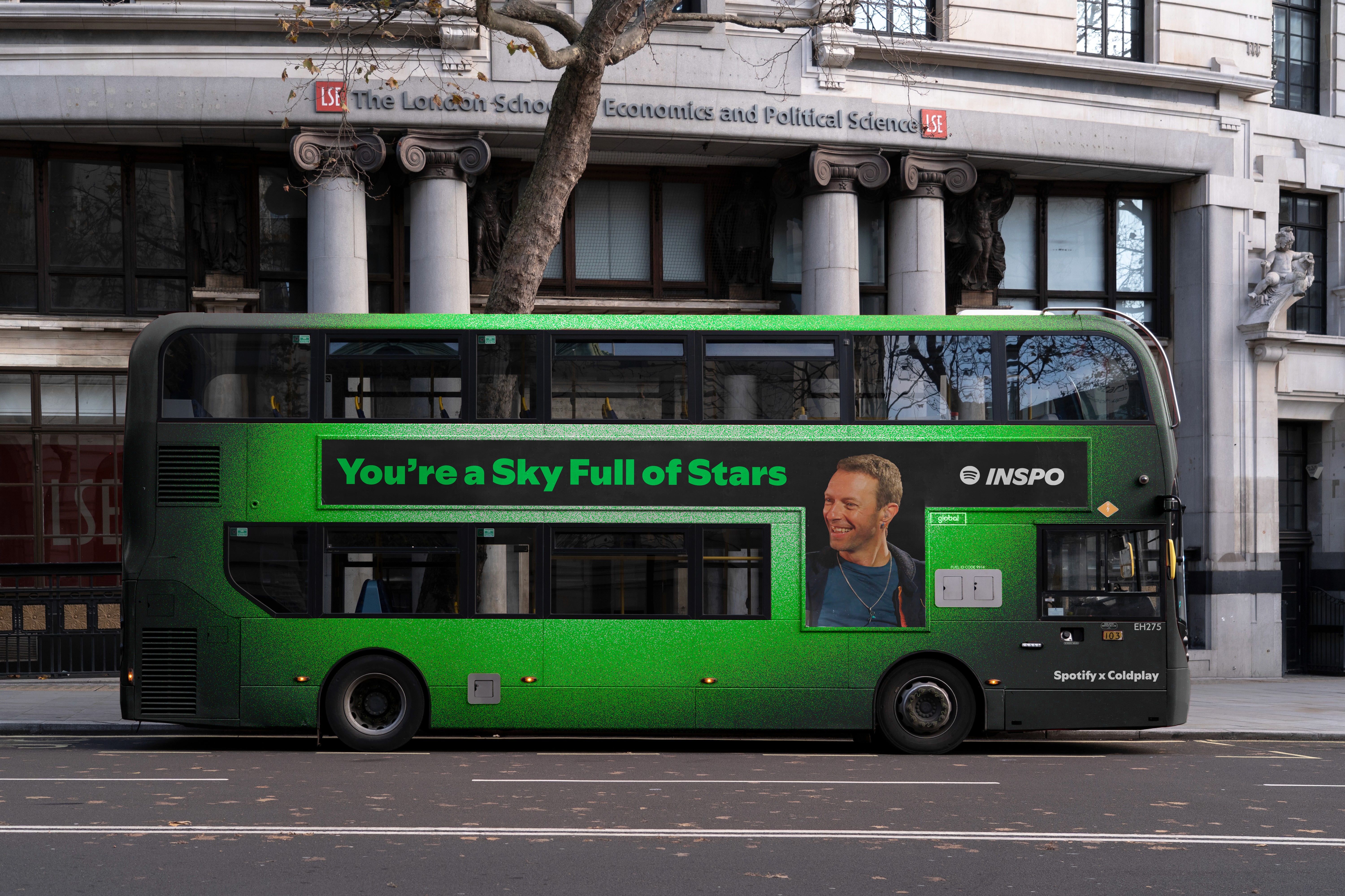
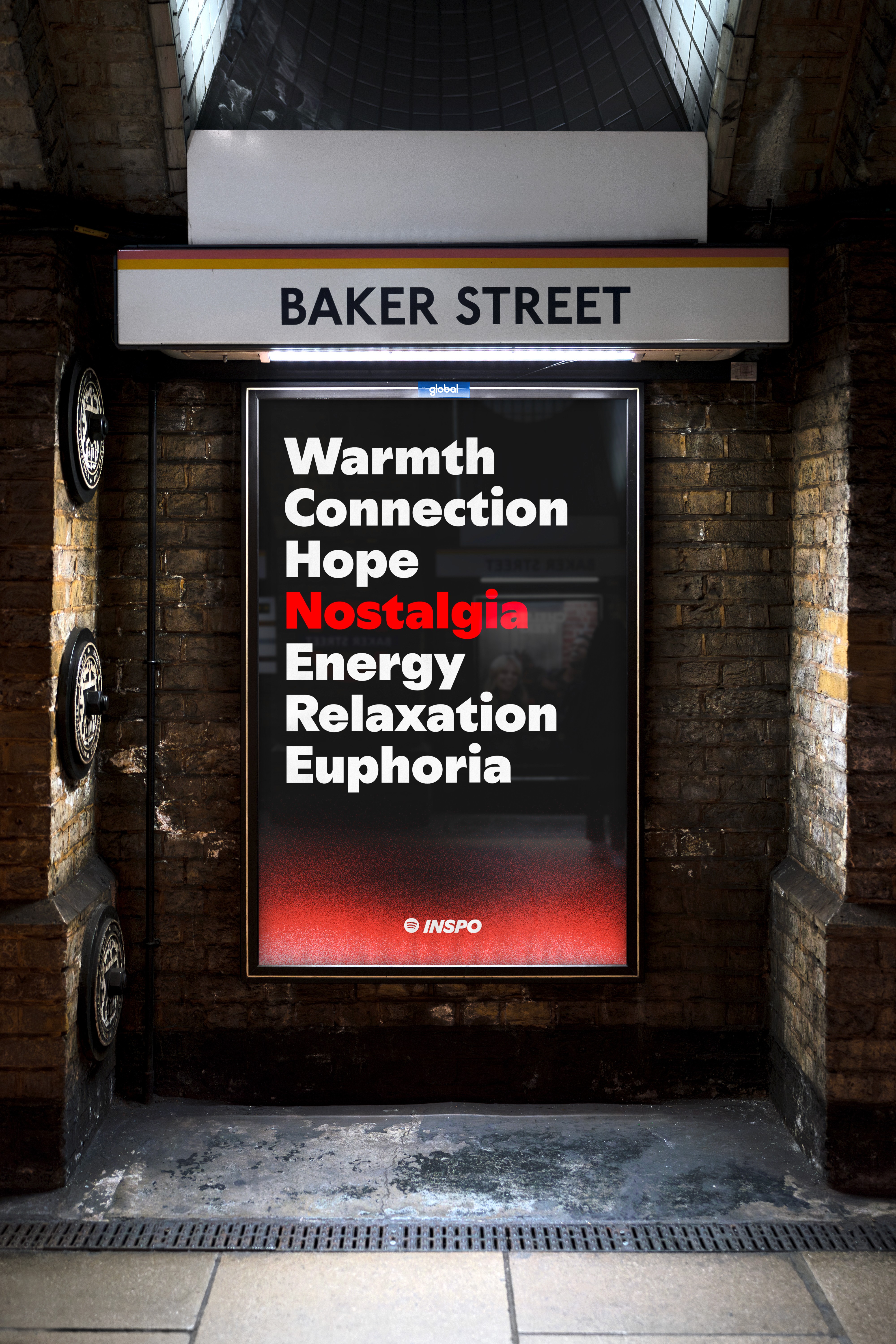
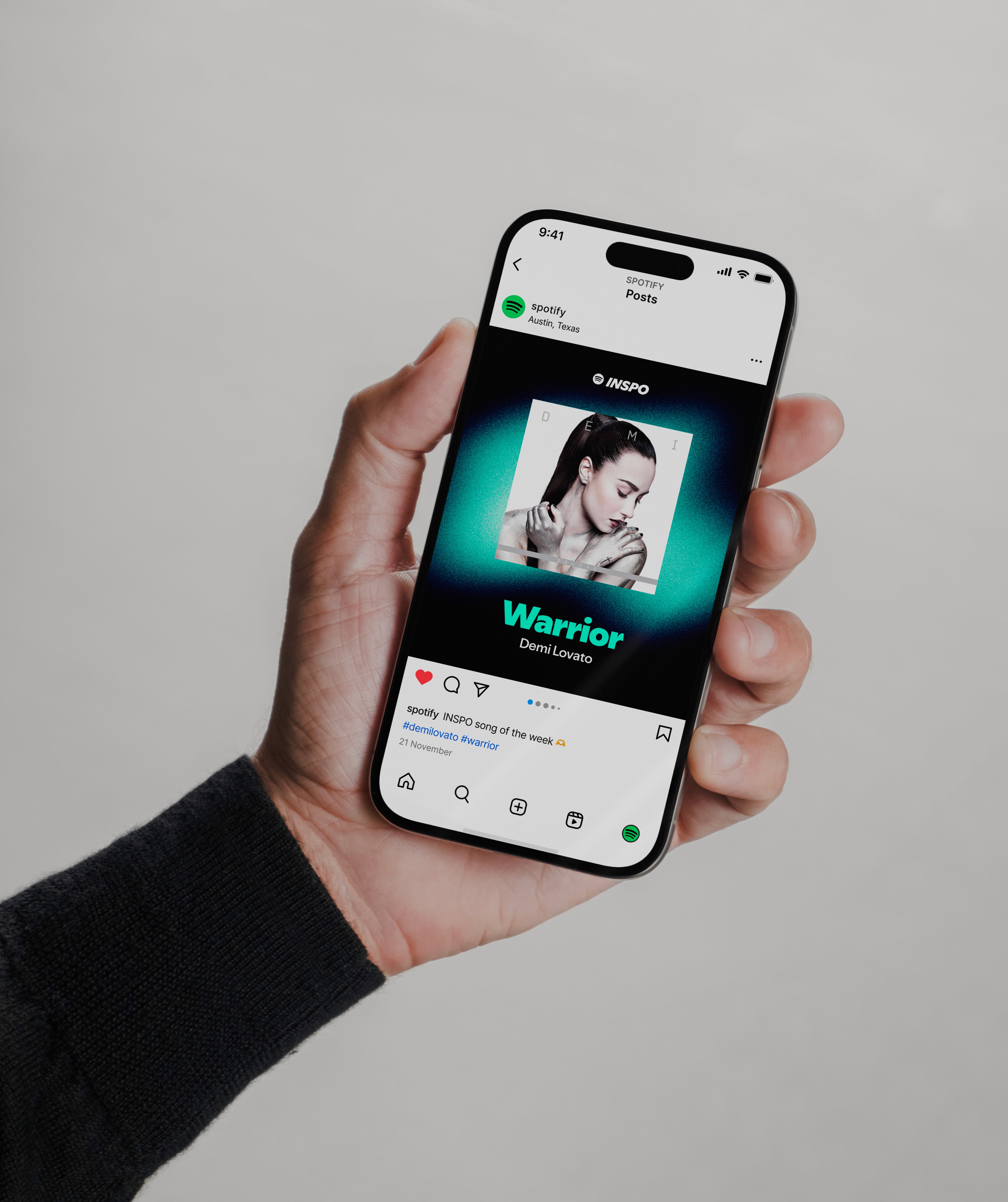
Introducing Spotify Inspo a concept campaign designed to inspire commuters during their everyday grind and lift their spirits. We brought bold, inspirational messaging to high-traffic commuter spots across London, offering quick hits of motivation paired with curated Spotify playlists and engaging content. Because commutes can be hard, and sometimes a short, simple message is all it takes to change the mood. Visually, the campaign leans into Spotify’s refreshed typographic system—clean, modern, and unapologetically bold—paired with a high-energy colour palette of neon gradients and high-contrast blacks. Whether you’re seeing it in a Tube station or across a digital billboard, it’s designed to stop you for a second and offer inspirational and radiate positive feelings.
Introducing Spotify Inspo a concept campaign designed to inspire commuters during their everyday grind and lift their spirits. We brought bold, inspirational messaging to high-traffic commuter spots across London, offering quick hits of motivation paired with curated Spotify playlists and engaging content. Because commutes can be hard, and sometimes a short, simple message is all it takes to change the mood. Visually, the campaign leans into Spotify’s refreshed typographic system—clean, modern, and unapologetically bold—paired with a high-energy colour palette of neon gradients and high-contrast blacks. Whether you’re seeing it in a Tube station or across a digital billboard, it’s designed to stop you for a second and offer inspirational and radiate positive feelings.


full story
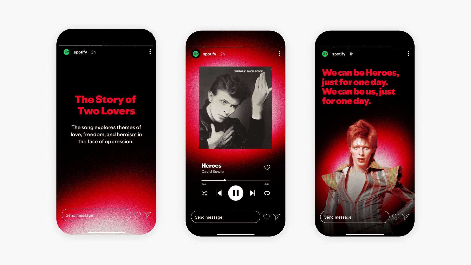
The campaign was built around one clear idea: music and lyrics can lift peoples days. We brought Spotify Inspo to life across high-footfall locations throughout London with dynamic billboards, glowing Tube takeovers, and digital screens that display inspirational messages. Each line of copy was crafted to feel personal, short enough to read while walking, and impactful enough to stay with you. Messaging from a range of musical genres so nobody is left out like “I'm a survivor. I'm not gon' give up" by Destiny's Child and "We can be heroes, just for one day" by David Bowie. These are presented during the morning rush, lunchtime and post-work wind-down, offering quick access via QR codes to Spotify playlists tailored to those times of day.
Visually, the campaign is rooted in Spotify’s updated typographic system launched last year clean, bold, and unapologetically expressive. The type takes centre stage, combined with a vibrant colour palette of high-contrast black and neon gradients. This created visual energy, a sense of motion and mood that mirrors the movement of the city itself. Even in crowded, grey transport hubs, the work stood out—bright and direct, yet never overwhelming.
Full Story
The campaign was built around one clear idea: music and lyrics can lift peoples days. We brought Spotify Inspo to life across high-footfall locations throughout London with dynamic billboards, glowing Tube takeovers, and digital screens that display inspirational messages. Each line of copy was crafted to feel personal, short enough to read while walking, and impactful enough to stay with you. Messaging from a range of musical genres so nobody is left out like “I'm a survivor. I'm not gon' give up" by Destiny's Child and "We can be heroes, just for one day" by David Bowie. These are presented during the morning rush, lunchtime and post-work wind-down, offering quick access via QR codes to Spotify playlists tailored to those times of day.
Visually, the campaign is rooted in Spotify’s updated typographic system launched last year clean, bold, and unapologetically expressive. The type takes centre stage, combined with a vibrant colour palette of high-contrast black and neon gradients. This created visual energy, a sense of motion and mood that mirrors the movement of the city itself. Even in crowded, grey transport hubs, the work stood out—bright and direct, yet never overwhelming.


